Intro
As the world becomes more environmentally aware of the negative affects of single use plastic, individuals are doing their part to try and reduce the plastic waste. Doo Good is an e-commerce mobile website that helps pet owners solve single-use plastic waste, one poop bag at a time.
Role
UX/ IU Designer
Team: Two UX/UI Designers
Timeframe: 2 weeks
Tools: Adobe XD, Sketch, Overflow, Photoshop, Google Forms
The framework
DISCOVER
Research the current doggie waste bags in the market to find which ones are leading in popularity and why- while also diving into what the users needs and pain points.
Audits
During our research we found doggie bag sites that looked very similar. Most of the brands were earth-tone colors (green and brown) to represent sustainability, but, also exuded no-thrills or character. This was the first problem we faced, how do we differentiate ourselves and create a modern, sleek and fun poop bag brand? We found some inspiring brands that we considered as best in class and got major inspiration from.
Nike.com: major inspiration for sleek and clean design
Wildone.com: modern pet supply brand with great search engine
Chewy.com: e-commerce site with easy checkout and clear CTA
Survey
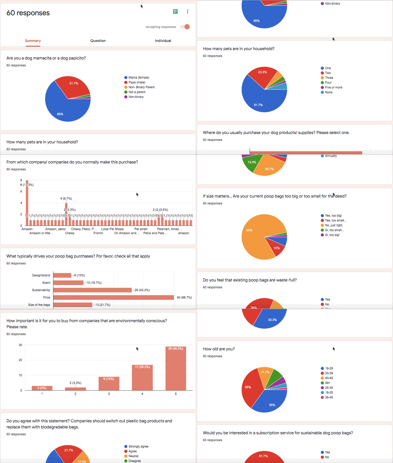
We surveyed 60 participants and gathered information from pet owners on their go-to pet supply shopping methods and their likelihood of purchasing environmental friendly products. The survey was helpful by shedding light on where pet owners usually shop their pet.
DEFINE
Who will use this product? What are the business goals and how will we measure them? What is the journey between our user and the digital product? Let’s dive in and build our assumptions.
Persona
With the feedback from our 1 on 1 interviews and survey, my partner and I received useful information on pet owners, their frustrations and their eco-friendly purchases, if any. As a result, we created two personas that best represented our user. Meet Cory Smith, the persona I created, who is highly skeptical of items labeled “eco-friendly”.
Hi-Fi Task Flow
Sitemap
DESIGN
Taking our hypothesis and creating solutions via design.
Wireframes
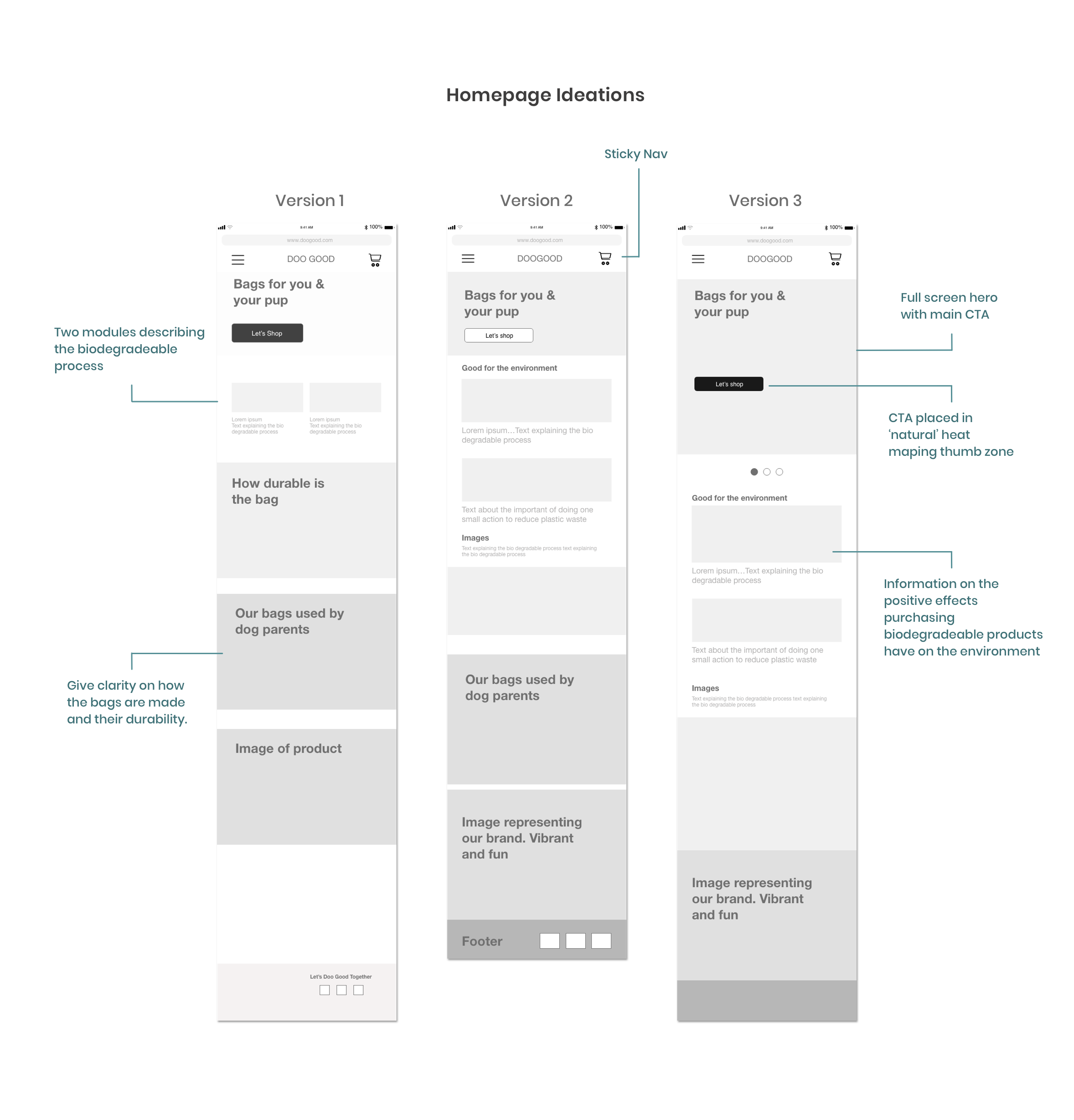
This is where my partner and I went our separate ways and my role in leading the remainder of the project began. Creating wireframes is one of my favorite parts of the UX process, it allows me to merge my love for logic and data with creativity and design. The main focus on these wireframes was to make sure I solved pain points and user needs, for both personas that my partner and I created.
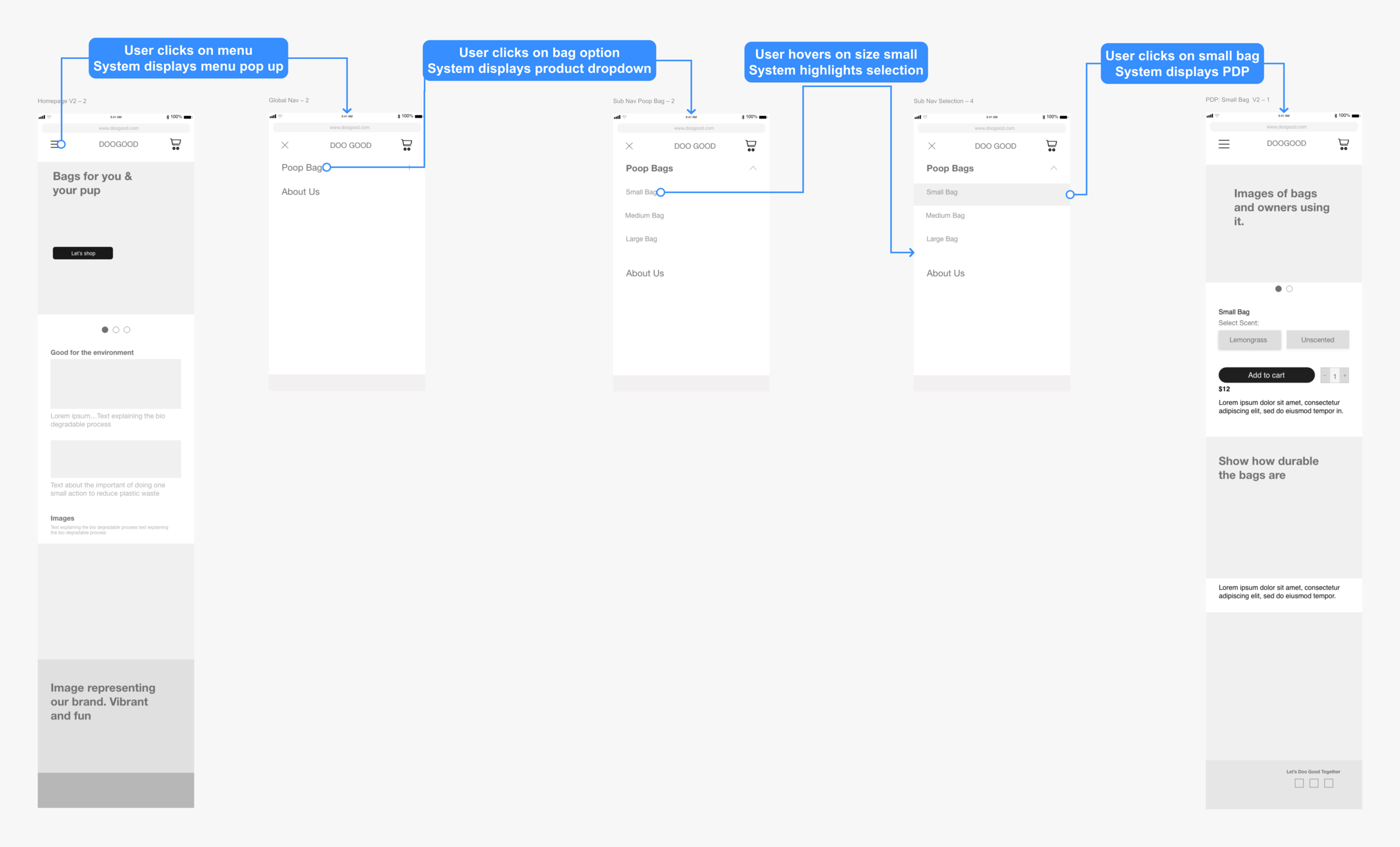
Task flow from landing page to PDP
Checkout
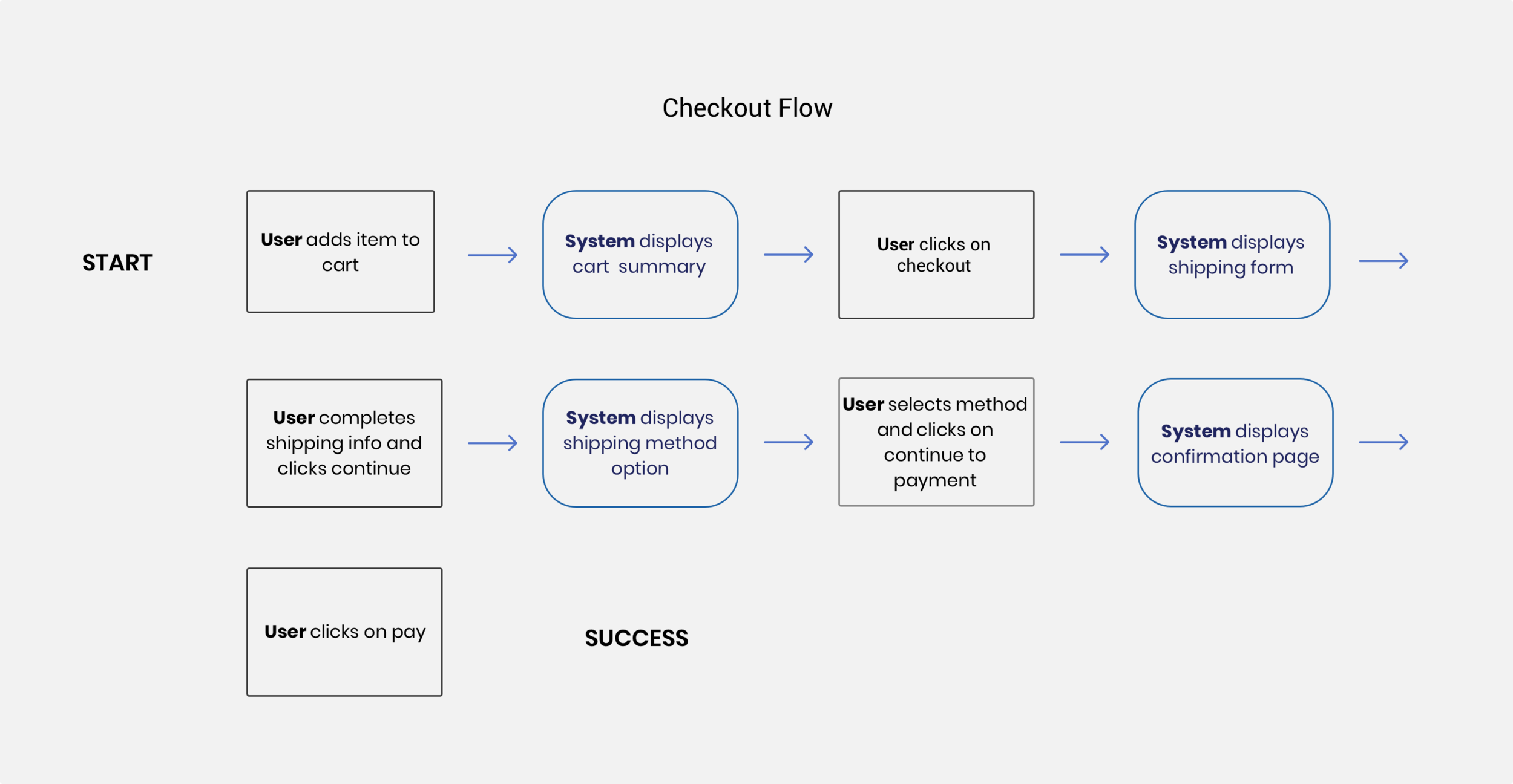
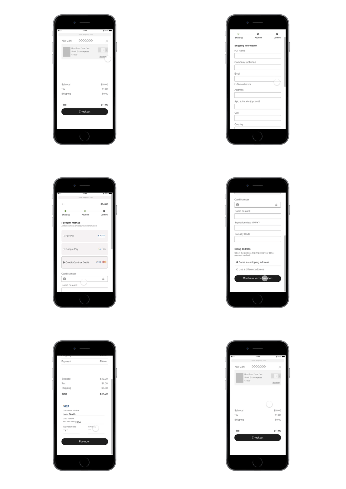
During our research, we found that mobile checkouts are crucial for either conversions or cart abandonment. Making the process as effortless and precise as possible was the goal. We achieved it by following Luke W’s forms best practices and providing quick checkout options. To ensure the user had options for a speedy check out we included secure express payment options such as PayPal and Google Pay.
Checkout prototype
TEST & ITERATE
Guided by Lean UX methodology, we got to testing right away. Prototyped our latest version of wireframes and get user feedback early on. From there we iterate and loop back to design.
Round one of testing
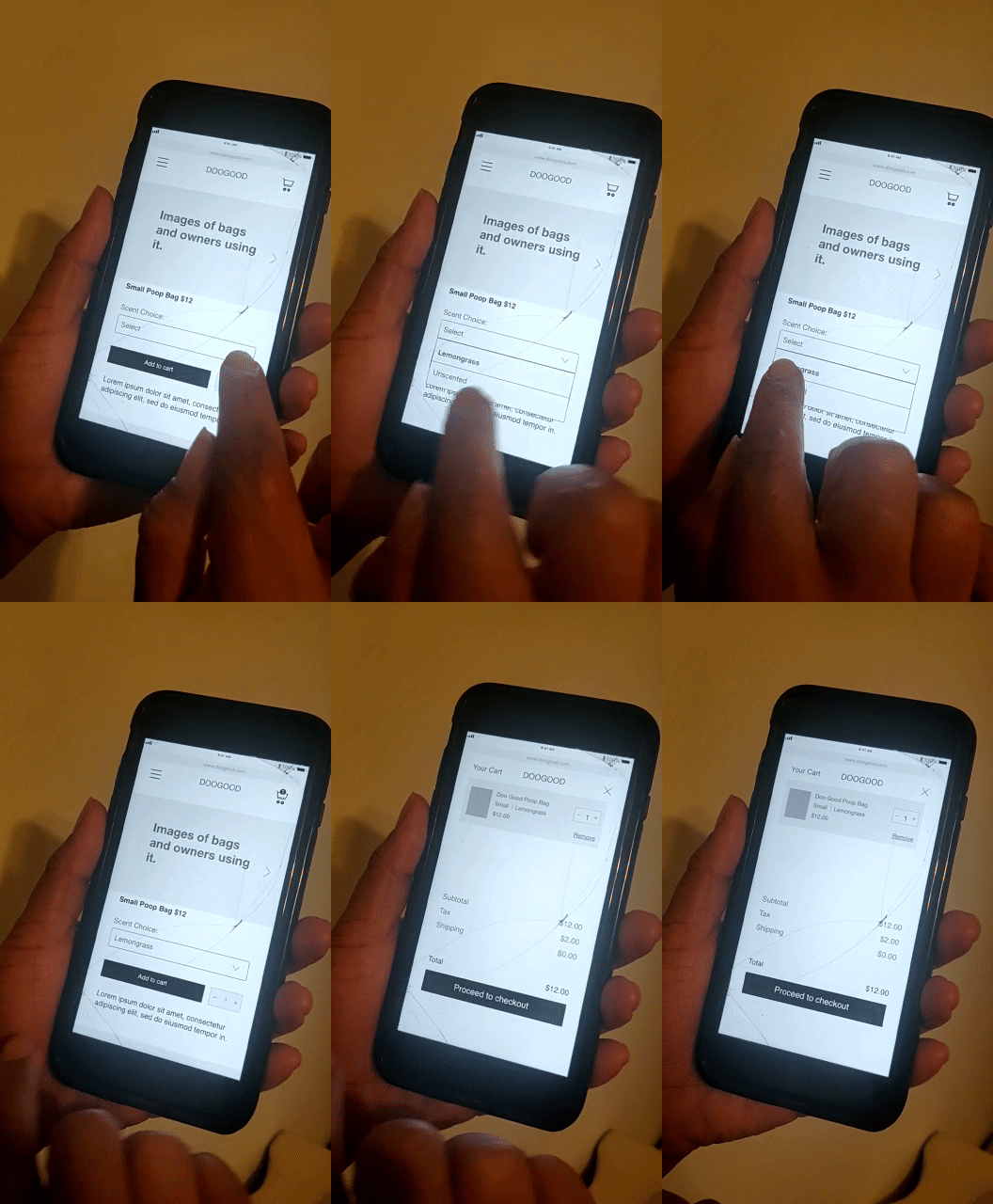
We went to Venture Cafe in Miami and were able to test on 12 people of different backgrounds and age groups. One key takeaway that we noted was that a majority of the users were skipping the scent option, unless otherwise instructed to complete it. We knew we had to design a second iteration to re-test.
Iterations
On the first round of testing we found problems with the scent option as a drop down menu. We created an alternate version using exposed chips and found this version yielded better results with 12 users during usability testing. The exposed option was used on the final version.
Mood board
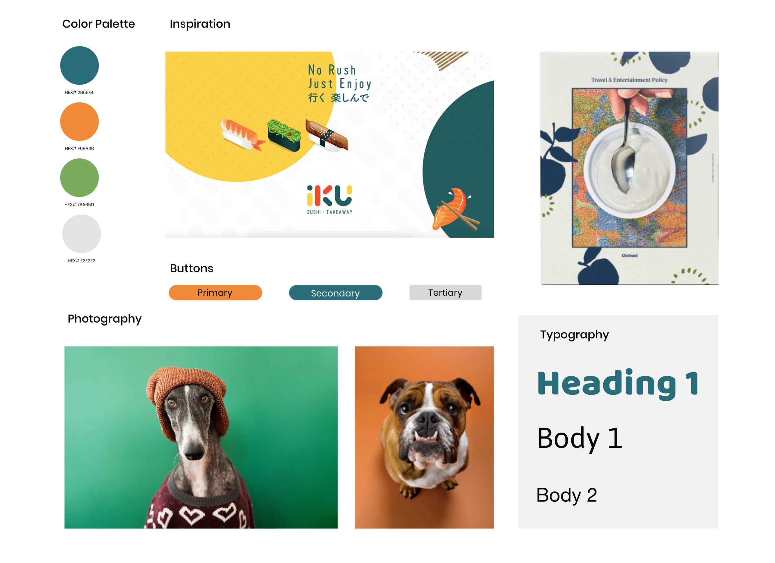
When we started this project we knew right away we wanted to create a contrast to the typical eco-friendly dog bag in the market. I wanted Cory (persona) to feel delighted and informed while using Doo Good. Choosing bright and fun colors to represent the brand while keeping the images clean and minimal.
The Evolution of Doo Good
The Launch
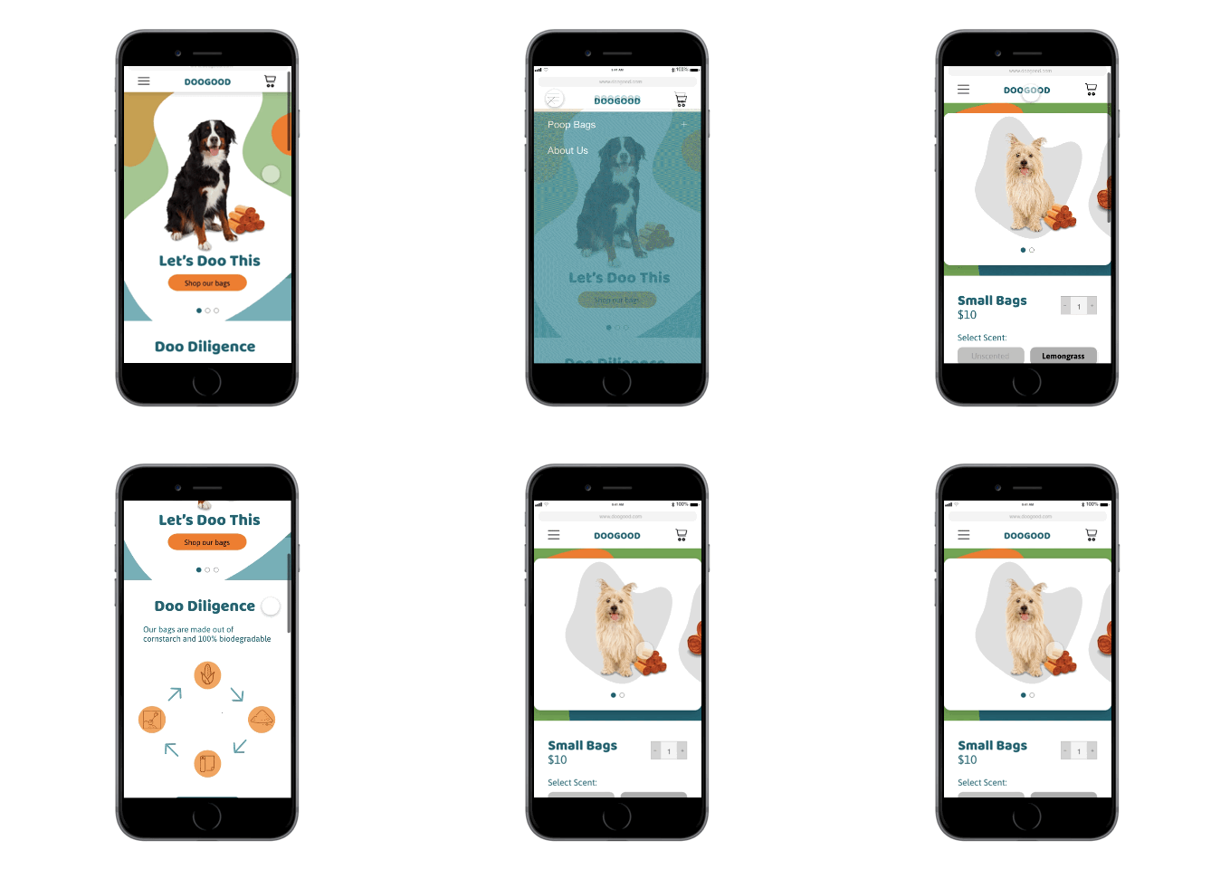
This is our launch version. Proud of where I was able to take it with the tight time frame we had and excited to see where it can go in the following versions post launch.
Final decisions
Finding the right hero took a few rounds of iterations and playing with the design. Ultimately the version that felt the most fun and playful won. Always keeping in mind the ultimate goal of creating a brand that stands out from what is, currently, in the market .
Take aways
One of the takeaways from this project was realizing users mental models, of the checkout process, are very engraved. Doing anything to halt that process or “make them think too much” can cause major hiccups. However, users are constantly growing and learning new behaviors. The Doo Good team made sure to listen and create accordingly. We are excited to see this product bloom and grow.


